
Falling for Film
When it comes to color photography, living in the Northeast has a major advantage.
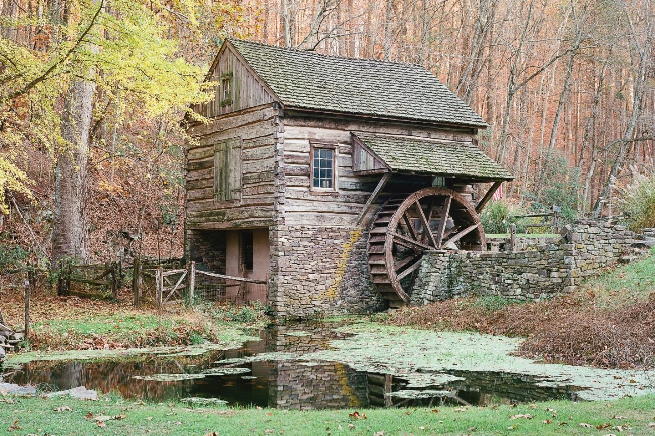
We get that classic stunning fall foliage. The vibrant warm colors of the changing leaves work so well with the farms, rivers, waterfalls, and covered bridges we have in our area. There’s a postcard to be made at least somewhere in every square mile. Not to mention all the photographic events like the scarecrows at Peddler’s Village or one of the many haunted hayrides our area has to offer. This time of year screams film.
I want to take this opportunity to have a more in depth look into film. Specifically color film and the differences between them. It’s one of the most common questions I get and this time of year is the perfect backdrop for an explanation. The film we use can have a great effect on our final image. It’s both a creative choice and a matter of selecting the best tool for the job.
Let’s first talk about film speed or ASA. This is a number located in large print on the box and is most commonly either 50, 100, 400, or 800. The number represents how sensitive the film is to light. The lower the number the less sensitive it is and the higher the number the more sensitive it is. Someone planning on shooting indoors might make a practical decision and use a higher speed film due to the lack of available light. It’s important to know that as we go higher in film speed more grain is introduced into the image. Film speeds of 50 and 100 will be virtually grain free but 400 and 800 will show some minor grain. 100 speed film or lower would be the best choice if your intent is to make a large professional looking print of say a beautiful covered bridge scene. Just remember that you’ll be shooting with longer shutter speeds when using a low sensitivity film for landscape work. Camera shake will become an issue and you’ll need to use a tripod in this scenario. If your intent is to only use your camera handheld, a higher speed film would make more sense. I think the results you’ll get with a clean looking slower film is worth the extra effort.
One of the most fun things about shooting color film is how each type has a completely different look from a creative standpoint. I like to break the films down into two main categories and ask myself one question: Will the image have people in it? Let’s first say the answer is no. There are certain films that are engineered to have very vibrant saturated colors. These films are perfect for autumn scenes. The colors in the changing leaves will pop in ways that a digital camera has yet to be able to duplicate. A specific example of a film like this is Kodak Ektar 100. This film produces beautiful intense color. I recommend it for landscapes, pumpkins, farmhouses, etc… anything with bold colors. However, I would not recommend it for portraits. Due to its high saturation it can make skin tones run orange and unnatural looking. Another option for fall scenery would be slide film. Slide film produces a positive image instead of a negative. Therefore, slide film can be ran though a projector and shown on a screen. That’s not the only reason to shoot it though. Slide film also produces vivid colors and is generally the sharpest and most professional looking of all the films. Many people shoot it with no intent of ever using it with a projector. They simply prefer the overall quality of it. Slide film is definitely for the more experienced shooter. It has very little wiggle room for mistakes in exposure. If you get it right, it’s stunning. If your exposure is off by even a small amount, you’re left with an unusable image. A few slide films I recommend are Fuji Provia 100, Fuji Velvia 50, and Kodak Ektachrome 100. Keep in mind, these films like light and look best with a daylight color balance. The colors will be muddy and very underwhelming shot on highly overcast days. I wouldn’t waste the money. Use your iPhone on lousy days or shoot in black and white.
Let’s say you’re heading out to a pumpkin patch or going apple picking with the family. This a fantastic setting for family portraits. Kodak has a line of films color balanced for skin tones that will make your family portraiture look impressive and almost painterly. It’s called Kodak’s Portra line and it comes in three types. Portra 160, 400, and 800. The numbers refer to the differences in sensitivity which I already mentioned earlier. Let’s talk about the differences in the look though. Portra 160 renders color very accurately and is a very sharp film. The results almost resemble those from a digital camera. However, it still has enough of a film vibe to make it worthwhile. Portra 400 is the most popular of the three. It produces magical muted colors and legendary skin tones. It’s also a very forgiving film. If your exposures aren’t always accurate, a usable image can be salvaged from this film. Even though it’s a professional film, I highly recommend this film for beginners. Portra 800 is the oddest (still pretty though) film of the bunch. When overexposed a bit, I find the the colors to be a little saturated. Some people overexpose it on purpose for this reason. When exposed more accurately the colors also run a bit softer just like Portra 400. The main benefit of Portra 800 is the extra sensitivity when shooting in lower light. They all render people in a fantastic way. You’ll never shoot portraits with a digital camera again after seeing the results.
It’s very important to mention that these are just general guidelines. Not only is it acceptable, but I encourage trying these films outside of their intended purposes. For example, shooting an autumn landscape with the muted tones of a portrait film can have gorgeous results, too. Sometimes the combination of the vivid fall leaves and a highly saturated film like Ektar 100 can be too intense for some tastes. Also, you technically can shoot portraits with Ektar 100 and avoid orange skin tones. Just make sure the subject is out of direct sunlight and in open shade. You’ll get a wonderful effect. The clothing and scenery will have vivid color but the skin tones will retain a natural look. The best of both worlds! There’s also some unique color films that I didn’t mention in detail that you can experiment with. For example, Cinestill 800T. Cinestill is real Hollywood movie film made to work in your 35mm camera. This film runs a little a blue and would look excellent at night around homes decorated for Halloween or haunted attractions. It creates a cinematic look. You won’t really know which films fit your style most until you try a few.
Start preparing for your fall photography now. Make sure your equipment is working. Plan the locations, time of day, and the films you’d like to use in advance. I find this time of year to go by the fastest of all the seasons. The leaves change, there’s a few amazing weeks, and then the opportunities are gone. I bet there are photographers in other parts of the country and around the world that would love to be in the Northeast this time of year. We’re very lucky. Get out there and make some great photographs!
Kenneth Taylor
contact@nycv.com